- Student Riddhi Tiwari
- Code UG180506
- Faculty Design
- Unit L3 Studio Unit
- Tutor/s Ruchi Mehta
- TA Ronit Halsore
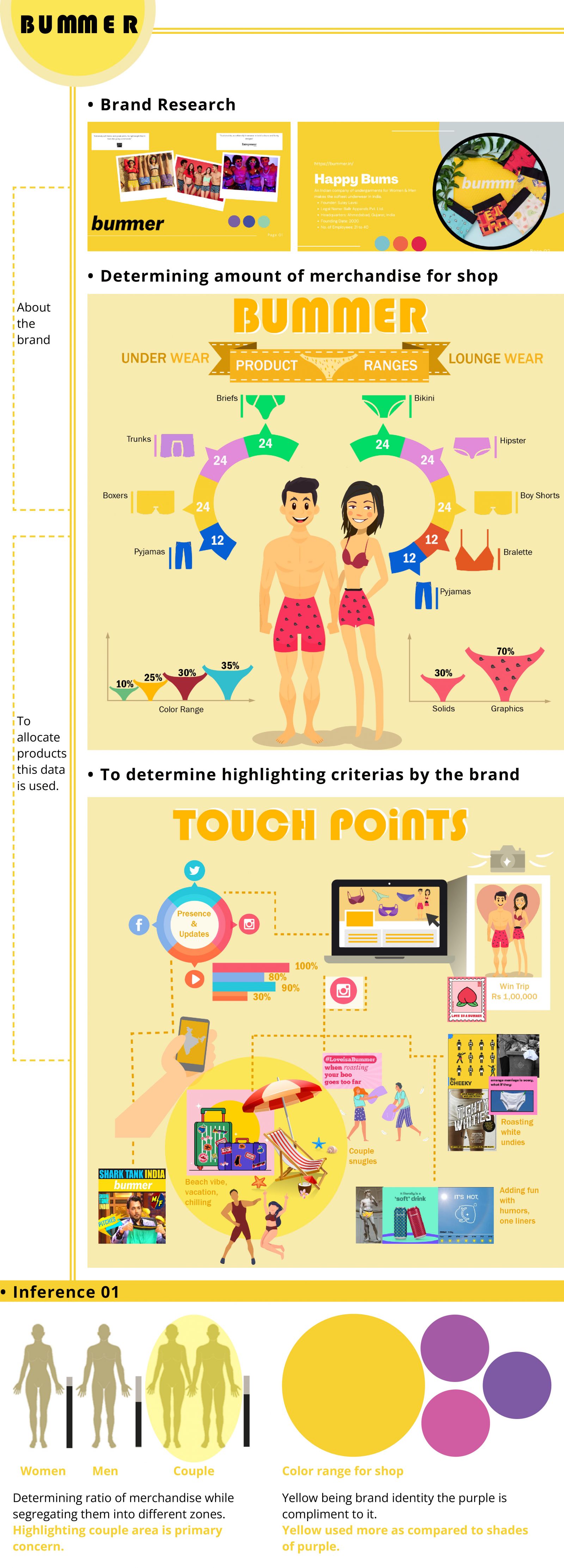
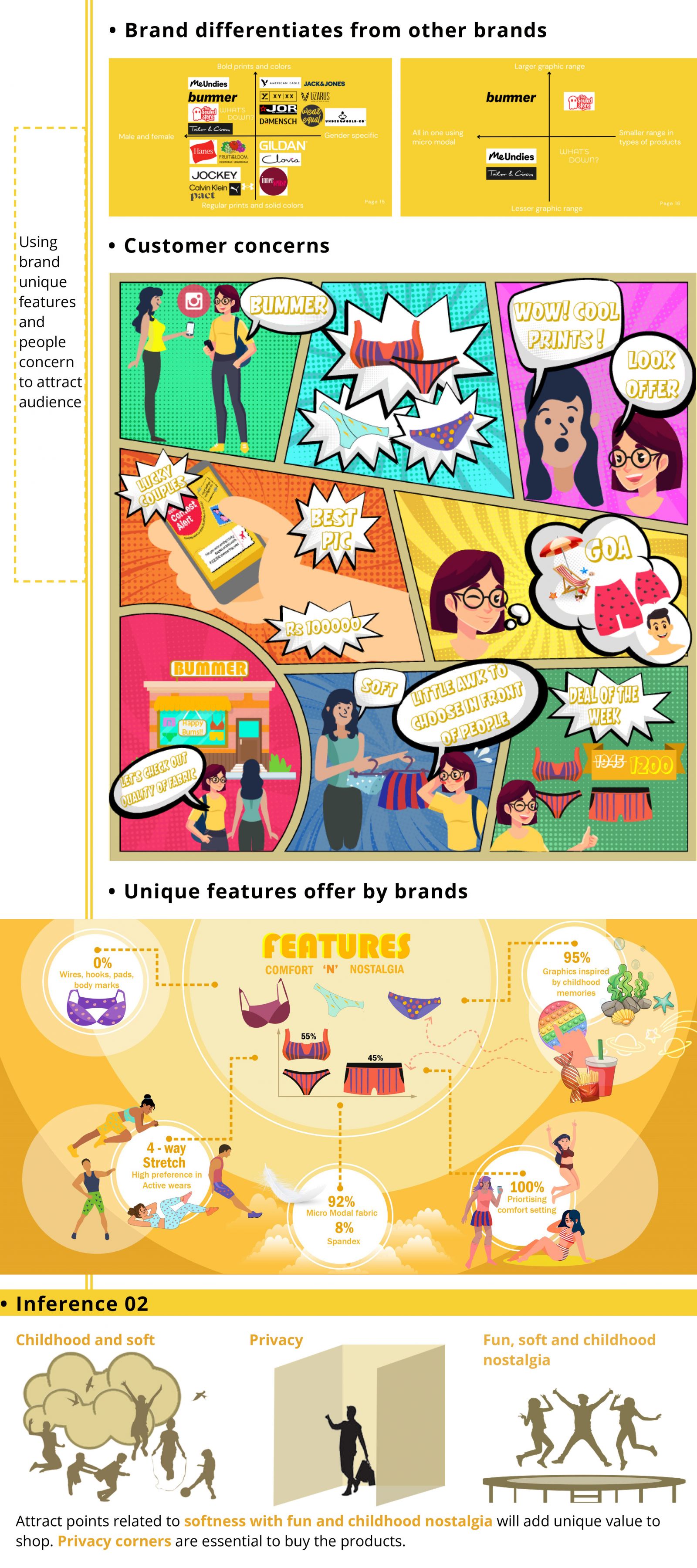
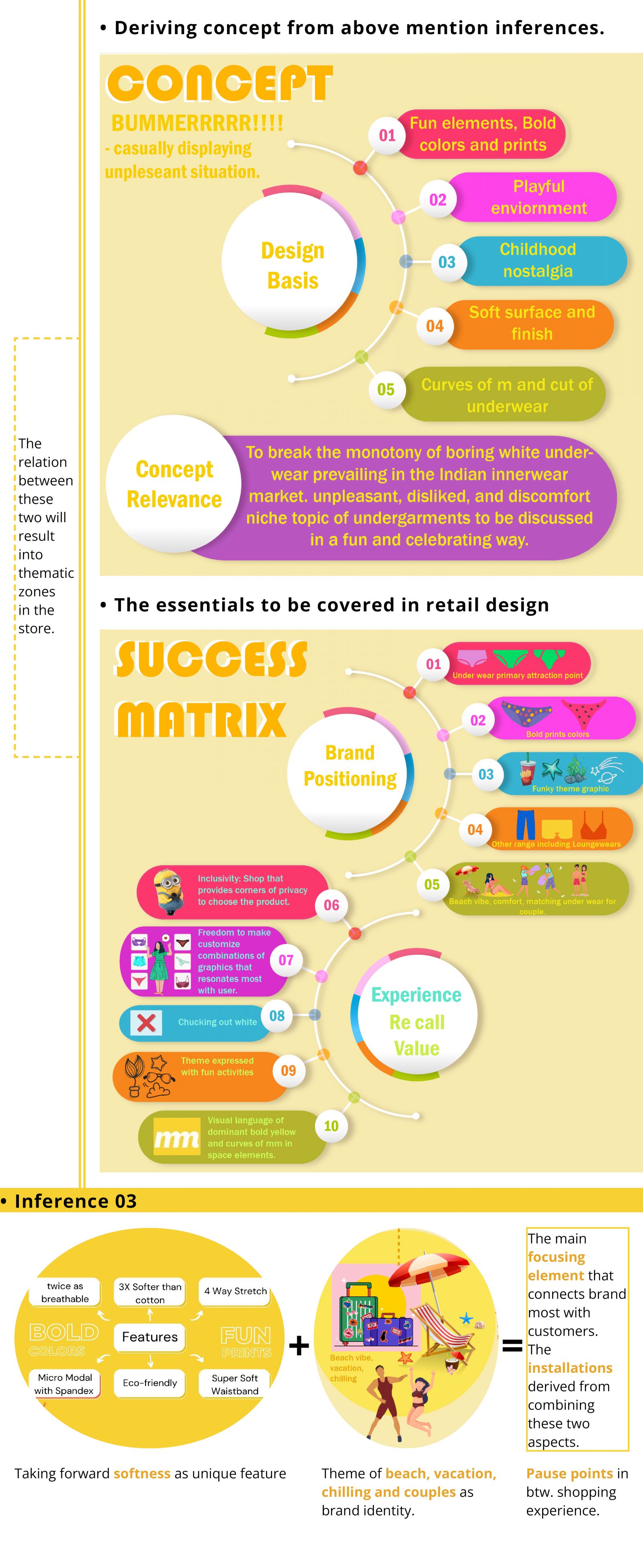
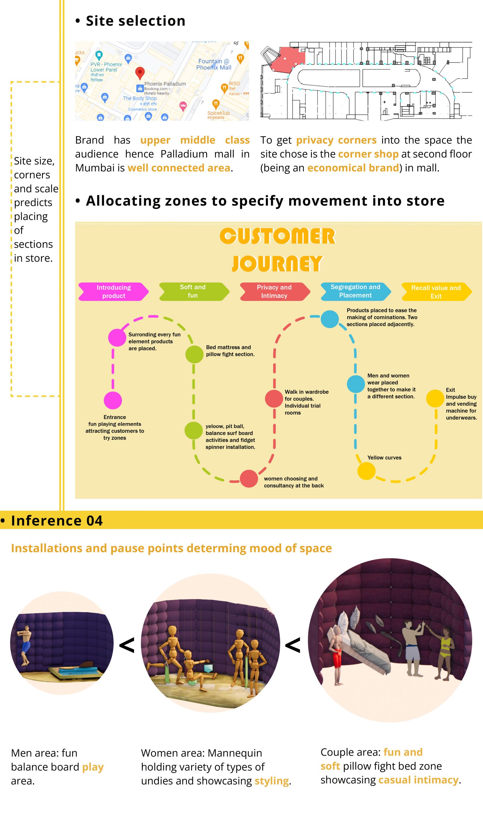
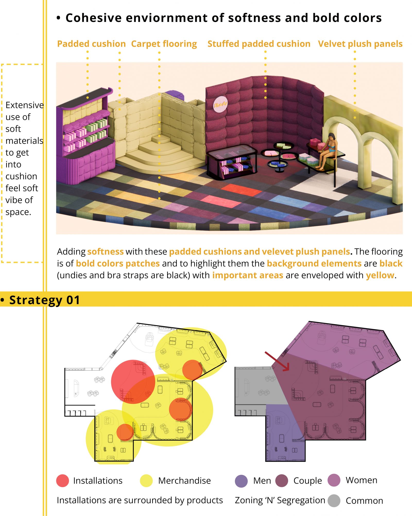
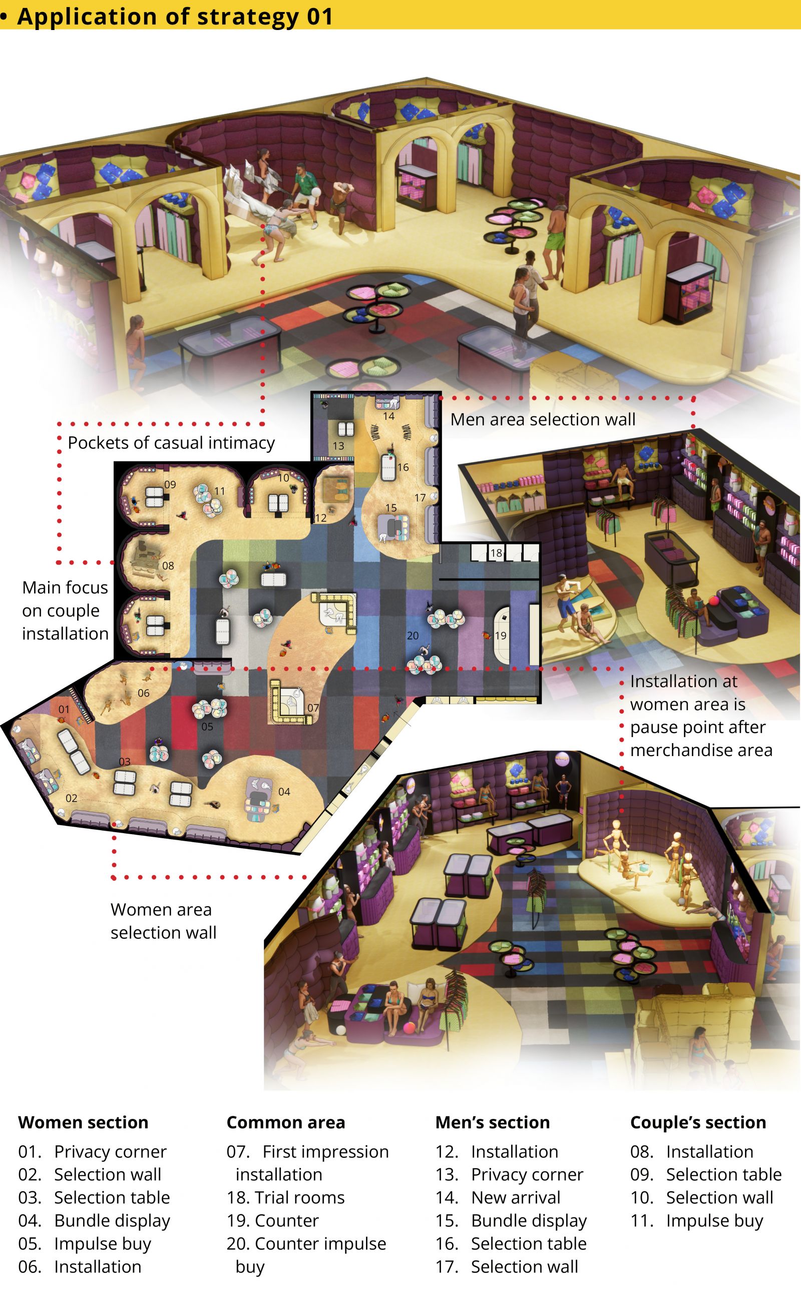
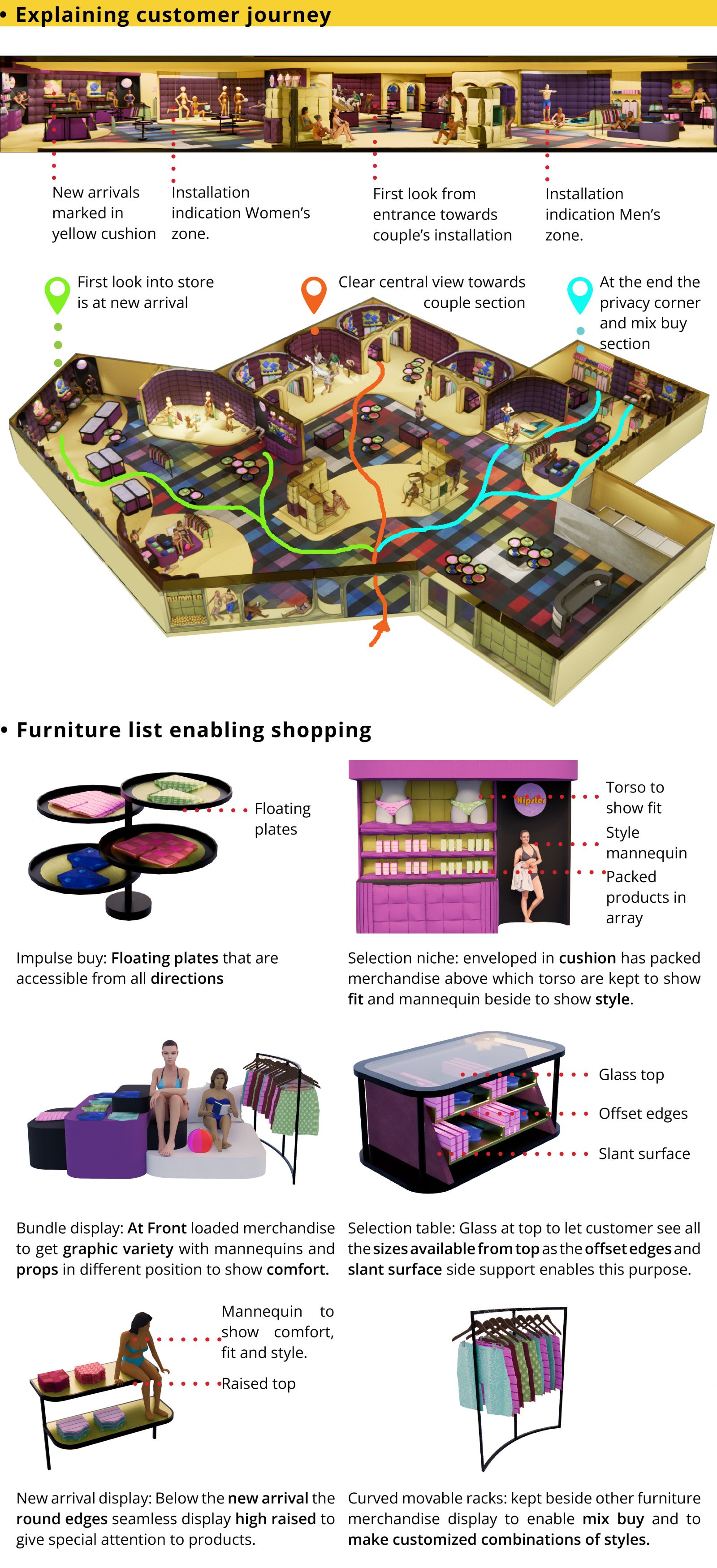
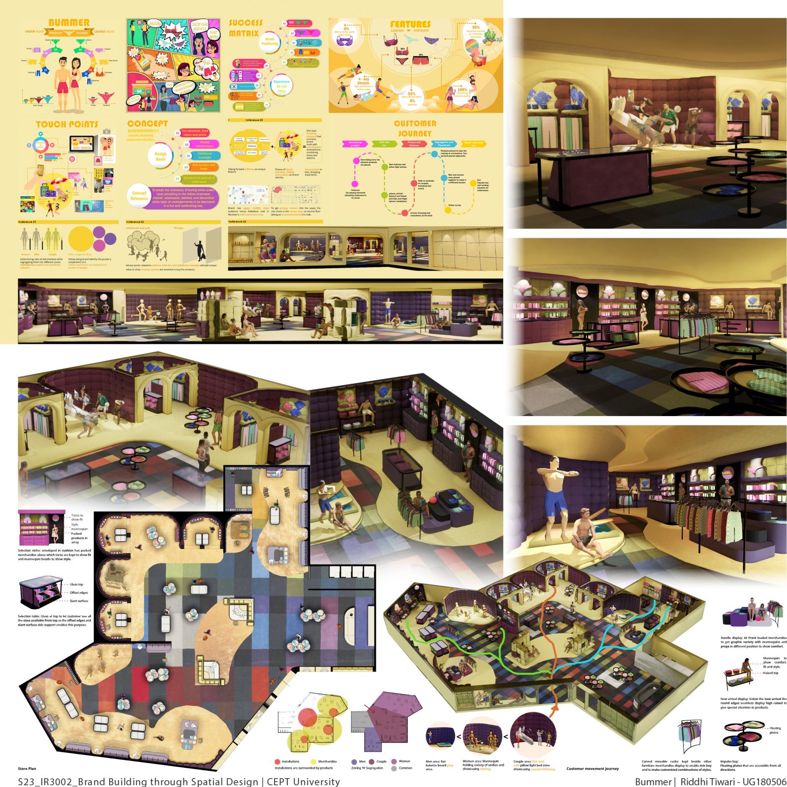
Bummer is an Underwear brand, currently an online brand that sells its products through Ajio, Flipkart, Amazon, and Bummer’s website It was launched by Sulay Lavsi in 2020. He launched to fulfill the need for a colorful intimate life with soft comfortable innerwear and a piece of sustainable fabric. The primary products are bifurcated for men and women as briefs, trunks, boxers and bikinis, hipsters, boy shorts, and bralettes respectively, where the common ranges are followed in loungewear. The main target is millennial couples as they influence more on matching pairs of undies, boxers, and pajamas. Being 4-way stretch, made from 92% modal fabric from beech wood abstract, and having bold prints and colors make this brand unique when it comes to more themes of prints inspired by childhood nostalgia than brands such as ‘me undies’ and ‘tailor and circus’. These aspects develop a vision to break the monotony of boring white undies and hence represent the voice of youth breaking taboos. The physical store placed at Palladium Mall in Mumbai is at the center of the well-connected area having the target group of upper-middle and middle audiences, being an economical brand this location will benefit the brand to attract the maximum amount of youth footfall. Creating a fun kind of experience in the store will help the brand to position itself an as a cool, youthful, funky type of brand in the minds of the people. With all these, the proposed store design has zones inspired by childhood nostalgia, privacy corners to choose products, and ease of making combinations between different ranges of products. The merchandise is kept in elements inspired by the brand association with the smoothness and comfort of the product. In addition to essential merchandise areas. This will help the brand to generate to create a cohesive fun environment having freedom, comfort, and inclusivity to shop for a product. Since the store is at the corner, the brand will get the attention of customers from its first impression generated by the view of the storefront having a fun play of graphics and shapes and leave users with a clue of the type of products provided by the brand to generate curiosity into customers. Thus, the proposed design will have an entrance where one can feel the funky and cool vibe as soon as they enter the store. The main attractive element will draw the customers to different zones giving them the freedom to move and choose from men, women, and couples zones. Once they go into a particular zone they can get the idea of fit through torse displayed over merchandise and comfort through displayed mannequins in different positions. And can feel the fabric and idea range of colors and graphics through bundle display and then make a selection from the products displayed in an array belonging to a specific type of range and color. All these elements are arranged such that there is clarity in respective zones and kept in flow format to make the transition between zones seamless with a pause in between every zone. The concept that binds this design and helps me achieve my design goals is to develop comfort, thematic zones, and a cool vibe through using the recall value of beach, couple, and casual intimacy associated with bummer. To achieve this material palate chosen has seamless flooring and a ceiling with curved skirting with elements having soft velvet overlay and velvet cushioning to emphasize on soft aspect of the products. The display will be light and sleek with curved and offset edges having a central element for the new arrival and a bundle display table for sale and general products and a curved module having an array of products and drawer storage for the same. The module will have bestsellers belonging to a certain style of product. In front of the module will be tabled having drawer storage having more range in the same style of product. This will help customers in their buying decisions. The sequence of spatial experiences as the customers move into this store. The storefront will communicate with the main mannequin element displayed which acts as the anchor point to showcase the fun, coolness, and comfortable vibe of the space and then attract them to thematic zones created surrounding which the merchandise is displayed. Thus, in a nutshell, ‘underwear that grows on trees and its quality to be the softest with the max. A range of bold and fun prints’ is the design concept that has guided all my design decisions and it will help in positioning the brand as soft, smooth, fun, cool, and youthful through interior elements.
